My Popular Posts

Sunday, 1 December 2013

Edited Photos

Before including my photos in my magazines I wanted to give them that little bit more edge than a normal shot.
My first photo is of my band The Shades however I just took a picture of the three other guys. I was trying to react a photo that Biffy Clyro had already had taken which I had in my research.

Before taking my photo I had to set Kyle, Shaun and Spock up in the order that I wanted and gave them a mug shot board for them to hold as you can see below. 
Once I took the photo I could move onto the editing, this was the most enjoyable part because I could experiment a bit with different tools. The first thing I did was I used the Lasso tool to cut round them so I had no background. Then I could work on the bruises and making parts seem bolder to do this I used the burn tool which allowed me to make out that they have bruises. My next challenge after the burn tool was to add colour to their skin and features which I simply used the adjustments moving up sliders until I got the effect I wanted. Then once all that was done I could move onto the background where I made a new layer and sent the mug shot wall to the back then the last thing I did was added a drop shadow to make it look more realistic.

Friday, 15 November 2013

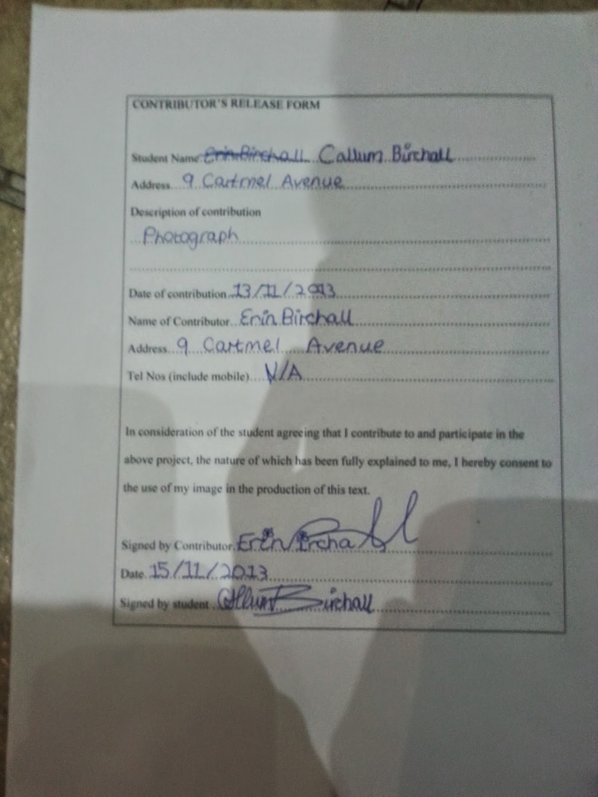
Release Forms


Photo Shoot 2


The next photoshoot I took was to get a photo for my contents page and was firstly unintentional but then I realised that it could be an affective photo to use so I took many photos until I decided with the photo below which I used on my contents page.
 

Photo Shoot 1


These photo's are the photo's I took for my front cover page and was the first photo shoot I took, in order to get the best shot possible, the photos above go in order of how I took them and as you can see they are progressing between each one until I got the final photo which is the photo you see below.


Photo Shoot 3


For my last photo shoot I only took two photos, the right photo you see I took with a filter on my camera to give the vintage effect and the other one I took with selected lighting as I wanted to reduce the chance of shadows but ultimately I was able to include both photos within my contents page.


Thursday, 14 November 2013

Uses and Gratifications Theory

This theory suggests that people actively choose their media products based on their needs.

Bulmer & Katz discuss that audiences consume the media for different needs and in different ways. The media industry is not the only one to blame, people need the media to fulfil their needs and wants.

Media consumers choose texts that fulfil one or more of these needs:

- To be INFORMED and EDUCATED about the world in which they live.
- To INDENTIFY personally with characters and situations in order to learn more about themselves.
- To be ENTERTAINED by a range and variety of well contructed texts.
- To use the media as a talking point for SOCIAL INTERACTION or DISCUSSION.
- To ESCAPE from their 'daily grind' into other words and situations.

Monday, 11 November 2013

Magazine Front Cover Mock Up


This document is a mock up for my magazine I will be producing over the next couple of weeks. I have bought many different magazines that will suit my magazine genre of Indie/Alternative and I have come to a conclusion of using the magazines that 'Q' designs as my inspiration and magazine style.

Thursday, 31 October 2013

Realism

The techniques by which a media text represents ideas and images that are held to have a true relationship with the actual world around us. Realism means different things in different texts. And through my research I have figured that it is important to assess how much a text strives for realism, and how much audiences are expected to think it is realistic. So that's why I created an interview that is truth to what was said in the real interview.
 

Constructing the Audience: Text

For me when this such media and text is being planned, perhaps the most important question the producers and myself consider is "Does it have an audience?" If the answer to this is 'no', then there is no point in going any further. If no one is going to watch/read/play/buy the text, then the producers are not going to make any money or get their message across. So this is why I have distinguished that audience research is a major part of any media company's work as well as my own. Part of their research consists of using questionnaires, focus groups, and comparisons to existing media texts, and spend a great deal of time and money finding out if there is anyone out there who might be interested in their idea. Which is what I've tried to do, not so much the money aspect but the element that are free and can be accessed through my own work.
From the research that I made I figured that my audience should be influenced via:
  • income bracket/status
  • age
  • gender
  • race
  • location
of their potential audience, a method of categorising known as demographics. So once I figured all this I could begin to shape their text to appeal to a group with known reading/viewing/listening habits.

Genre

For me Genre does not simply mean what's in a media text but also on the way it is constructed. This can be important, for example, when what type of music fans you are trying to attract, which can deal with similar subject matter, and look the same — Similar instruments — but belong to separate genres.
A media text is said to belong to a genre, as it adopts the codes and conventions of other texts in that genre, and lives up to the same expectations. Texts from different mediums may belong to the same genre but they all have their separate meanings and this is what I want to distinguish in my magazine production as it is something that is easily mistaken.

My Audience Terms

AUDIENCE ENGAGEMENTThis describes how an audience interacts with a media text. Different people react in different ways to the same text.
AUDIENCE EXPECTATIONSThese are the advance ideas an audience may have about a text. This particularly applies to genre pieces. Don't forget that producers often play with or deliberately shatter audience expectations.
AUDIENCE FOREKNOWLEDGEThis is the definite information (rather than the vague expectations) which an audience brings to a media product.
AUDIENCE IDENTIFICATIONThis is the way in which audiences feel themselves connected to a particular media text, in that they feel it directly expresses their attitude or lifestyle.
AUDIENCE PLACEMENTThis is the range of strategies media producers use to directly target a particular audience and make them feel that the media text is specially 'for them'.
AUDIENCE RESEARCHMeasuring an audience is very important to all media institutions. Research is done at all stages of production of a media text, and, once produced, audience will be continually monitored.

Unique Selling Point

Unique Selling Point or Proposition. The attribute of a text or product that is highlighted as being new or unique in the marketing process, something that sets it apart from its competitors. For my magazine I want to create a unique selling point of my own as this would keep the uniqueness going as I want to be an individual in the market with my own audience so I have figured that a key way for this success is to create a Unique Selling Point in which could be something big or small. Whatever it will be I will make sure that it is something that makes the audience decide if they buy my mag or not


Product Positioning

With my product I want to establish were I would position it so I've decided to establish it within a niche market as it may not be the industry leader but it will sell to my specific audience due to advertising appropriately to who I believe is my deemed segment of the audience.
 
The main three reasons for this decision is:

Less Competition

Give Market Insights

Build A Brand Loyalty


Stereotypes

Stereotypes are usually negative representations of people that more than often rely on preconceived ideas about the group that person is perceived as belonging to. It is assumed that an individual shares personal characteristics with other preconceived ideas e.g. blondes are all stupid, gingers have no souls...             

Although using stereotypes saves a lot of explanation within a text, it can be a very useful way to present something i.e. my magazines. However without being justifies stereotypes may be considered dangerous because as we all know most stereotypes that we see and hear today have been produced by the media as they encourage audiences to think large groups of people are all the same, and often have the same negative characteristics. Which shows how effective the media is.
 

Wednesday, 30 October 2013

Choosing my title font

For my Music Magazine I am going to choose my title font off www.dafont.com. I have narrowed the selection down to 5 and I am going to show you my decisions:
 
The first font is called Pulse Sans Virgin:


The reason why this is one of my option is because it links in with the whole Amplitude and Distortion however I know if it will give me the professional look I am looking for.
 
 
My second font is called Action of the Time New:
 
I chose this font once again because of its affect that it adds to Amplitude and Distortion however I think this font will suit my magazine more.
 
My third font is called Rythm N Blacks:
 
This font was the first font I saw however I don't think It will suit my genre or target audience as it gives off to me a comic value.
 
My fourth font called Rough Linen:
This font I thought also added to the Amplitude and Distortion value but once again I don't think I will work in my Music Magazine.
 
My last and fifth font is called Scorched Earth:
 
This last font I think will go really well with my Music Magazine but on the other hand I also think my second font Action of the Time New is a good font to use in my magazine but ultimately I think this font Scorched Earth will be the best font for me to use because it has everything I was looking for, for the title.


Ideas for my chosen genre: Indie Alternative / Indie Rock

Magazine Terms

Masthead - The name and logo of the magazine.
 
 
The Lead - The inductor paragraph of an article. Usually written in bold or capitals.
 
 
Body Copy - Refers to the text of your written articles, which should be produced as a printed presentation to accepted industry standard, e.g. correct use of language, font size, word limits etc. Usually written in columns.
 
Serif Fonts -  Fonts like Times New Roman, or Baskerville Old Face, which have little bars (serifs) on the end of the letters.
 
 
Sans Serifs Fonts - Fonts like Impact, or Agency FB, which do not have little bars (serifs) on the end of the letters
 
 
Drop Capitals - A really big letter which usually starts off the Article.
 
 
Cross Head - Small sub-heading used to split up large blocks of text.
 
 
White Space - White parts of the page other than text or pictures.
 
 
Mode of Address - How the magazine talks to the audience.
 

Sell Lines - Text on the cover that helps sell the magazine to the audience.
 
 
Banners - Text which usually stands out because it is on a coloured background.
 
 
House Style - Magazines distinctive design that separates it from competitors.
 
 
Borders - The gaps at the edges of a page.
 
 
Gutters - The gaps between columns of text.
 
Leading - The space between lines of text.
Kerning - The space between letters.
Strap Lines - A smaller headline, printed above the main headline.
 
By-Lines - Name of the person who wrote the article.
 
Picture Credits - Who took the picture, where did it come from.
 

Anchorage - The way in which text helps to pin down the meaning of a picture and visa versa.